beauty care line
year: 2011
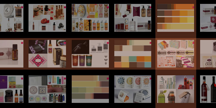
client: CONTER
category: beauty & personal care
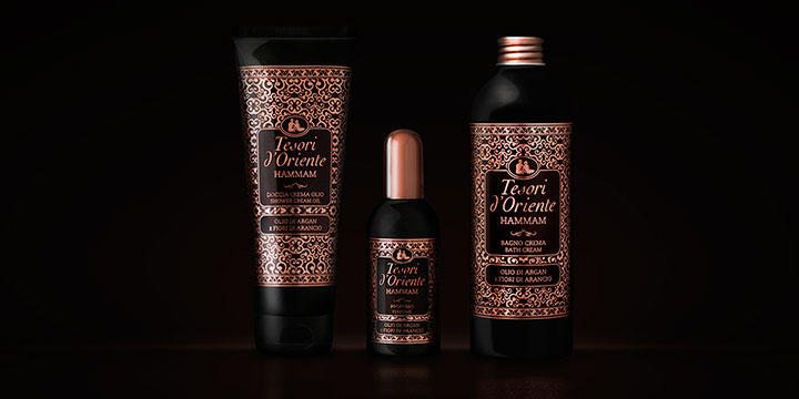
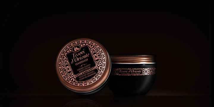
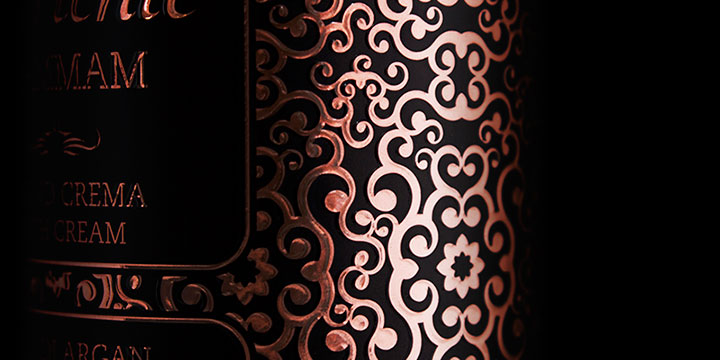
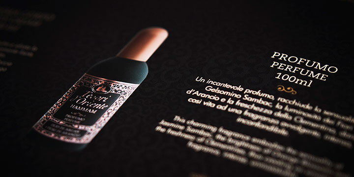
Restyling e riposizionamento di uno dei best sellers di tesori d’Oriente. La nuova identità visiva della linea è basata sul concetto di preziosità ed esclusività e sul richiamo ad un mondo decorativo caldo e opulento. Il risultato: un prodotto dal forte impatto a scaffale.
Restyling and repositioning of one of Tesori d’Oriente’s bestsellers. The new visual identity design was driven by the idea of preciousness and exclusivity, in order to obtain a product that was rich, warm and eye-catching.
KEYWORDS:
- gdo
- restyling strategy
- creative concept
- label finishing
- gift box design
- layout & pop materials
- sales support materials